
AI motion posters: give the message time to be read
Plan an AI motion poster around readable text. A six-second example compares two schedules and shows how to calculate the shared reading interval.
Sources checked:
Prepared with AI assistance; sources and conclusions are reviewed before publication.
On this page
When turning a static poster into an AI animation, give the essential message a period when it is fully visible and easy to read. A six-second video can contain much less than six seconds of usable reading time if the title arrives late, the details keep moving, or the exit animation starts early.
SenseTime's September 30 preview of Dynamic Design describes choosing which elements stay still and which animate, then arranging their timing. The company says access is limited to a beta ahead of launch. The plan below is an original design example; we have not tested that preview or reproduced its demonstration.
Decide what the viewer needs to remember
Consider a fictional ceramics workshop poster:
CLAY NIGHT Friday, 7 PM Studio 12
The viewer needs the event name, time and place. A rotating clay shape can help establish the mood, but it cannot replace any of those facts. Start by assigning each visible element a job:
| Element | Proposed treatment | Reason |
|---|---|---|
| CLAY NIGHT | One short entrance, then hold still | Introduces the event and remains available for reading |
| Friday, 7 PM / Studio 12 | Appear together and stay still | Lets the viewer read the practical details as one unit |
| Decorative clay shape | Slow movement away from the text | Adds motion without repeatedly covering the message |
| Background | Remain stable | Preserves contrast behind the lettering |
This is a design choice for this poster, not a rule that every title must stop moving. A short word can be the animation's subject. A date and venue usually have a more practical job.
In a recent r/MotionDesign discussion, Vane1st asked how designers decide which word deserves the main motion and argued that animating every word can obscure the hierarchy. That is a useful critique to apply to a draft, rather than evidence that any one animation tool will solve it.
Count the interval when the whole message is available
Here are two possible schedules for the same six-second loop. Times are our planning assumptions, not observed model outputs or a universal reading-speed standard.
| Message element | Draft A: fully visible and stable | Draft B: fully visible and stable |
|---|---|---|
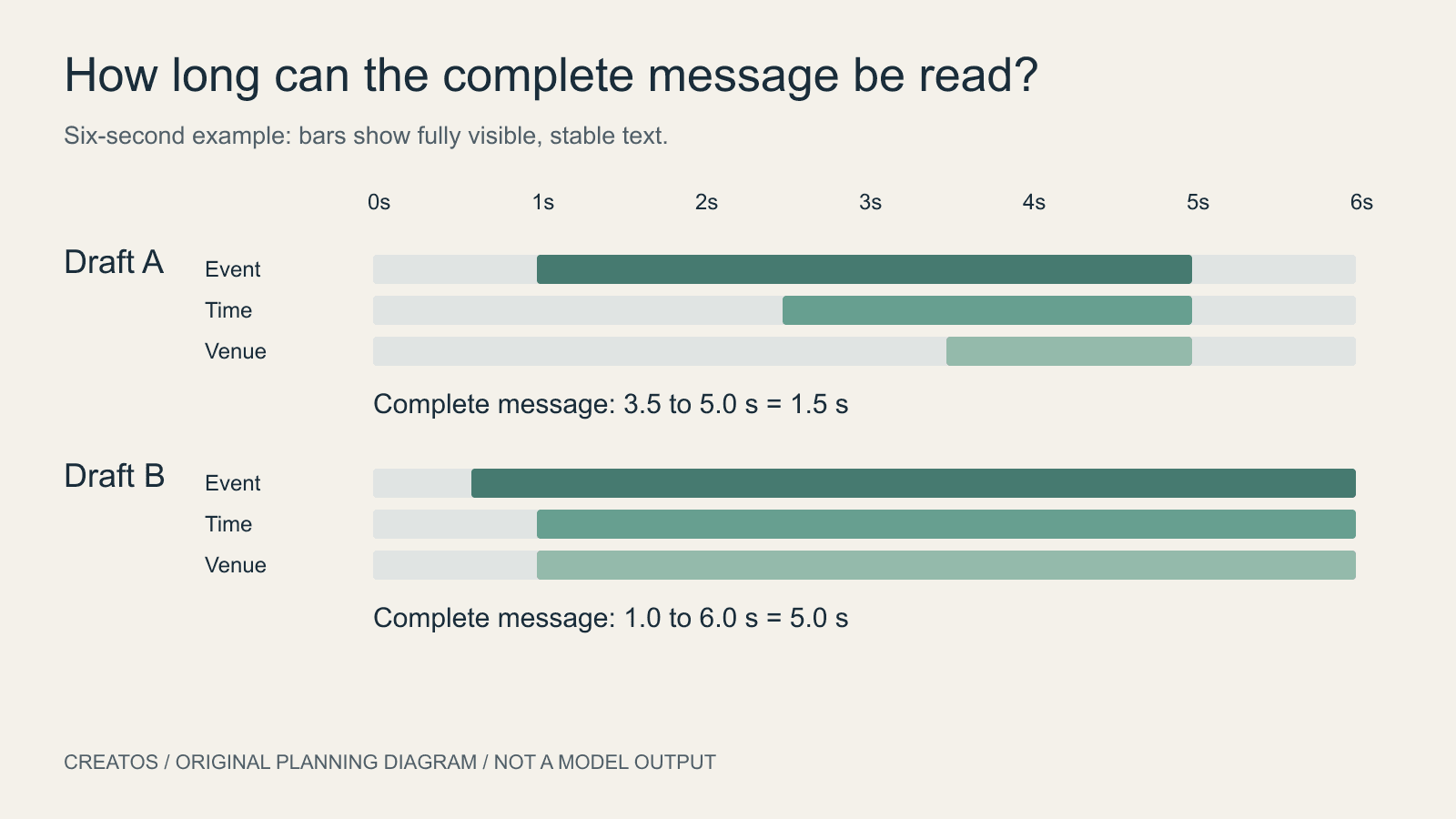
| Event name | 1.0 to 5.0 seconds | 0.6 to 6.0 seconds |
| Date and time | 2.5 to 5.0 seconds | 1.0 to 6.0 seconds |
| Venue | 3.5 to 5.0 seconds | 1.0 to 6.0 seconds |
Draft A gives the complete message only 1.5 seconds: the venue settles at 3.5 seconds and the shared exit starts at 5.0 seconds. Draft B gives it 5.0 seconds, from 1.0 through 6.0 seconds.
The calculation is the earliest end time minus the latest start time across the essential elements. If that result is negative, there is no moment when all the required information is stable together.
This calculation identifies a timing problem, but cannot certify readability. Typeface, contrast, screen size, language and the viewer's attention still matter. Watch the actual output at its intended display size. If someone cannot repeat the time and venue after one normal viewing, shorten the copy, bring it in earlier or extend the hold.
Brief the animation with a visible hierarchy
For the fictional poster, a proposed brief would be:
Use the supplied poster as the design reference. Keep its exact event name, time and venue. Let the title enter once during the opening 0.6 seconds. Show the time and venue together by 1.0 second and keep all essential text stable through the end of the six-second clip. Animate only the decorative clay shape after that point. Keep it clear of the lettering. Do not add an exit fade that removes the reading hold.
Treat those times as targets to inspect. A tool may not support exact duration or element-level control. If repeated generations keep redrawing the words, a practical fallback is to animate the decorative layer separately and add the exact text in a conventional editor. That is an editing workflow choice, not a claim about Dynamic Design's current controls.
Review the middle and the loop boundary
A final still cannot show whether the date flickered two seconds earlier. Review the whole clip, then inspect frames around each text entrance, the start of the shared hold and the loop boundary. Check spelling and placement against the original poster. Watch the transition from the last frame back to the first; an abrupt restart can distract even when both frames look acceptable alone.
For a design discussion, prepare a small strip of actual frames with timestamps and the static poster beside it. Creatos content nodes let you arrange those images with timing notes, so a collaborator can see exactly which entrance needs changing. Play the full animation in its video player as well; still frames do not replace a motion review.
Sources
- SenseTime Dynamic Design preview · SenseTime ·
- Motion hierarchy discussion · Vane1st
- Creatos content nodes
Continue reading
Browse all posts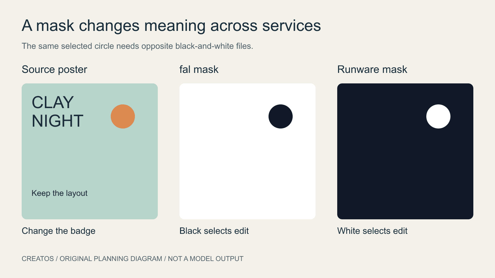
Ideogram 4.5 masks: black or white depends on the service
fal and Runware document opposite mask colors for Ideogram 4.5. Compare the conventions and check a local edit before submitting a full-size mask.

Meshy packaging references: match every visible face
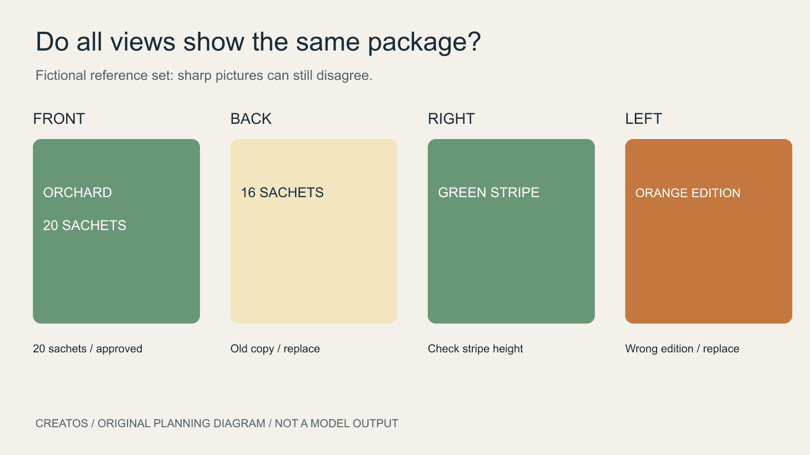
Prepare Meshy packaging references that agree on every visible face. Check editions, wording and graphic seams before reviewing a generated 3D product demo.
AI-generated icons: match visual weight in a real interface
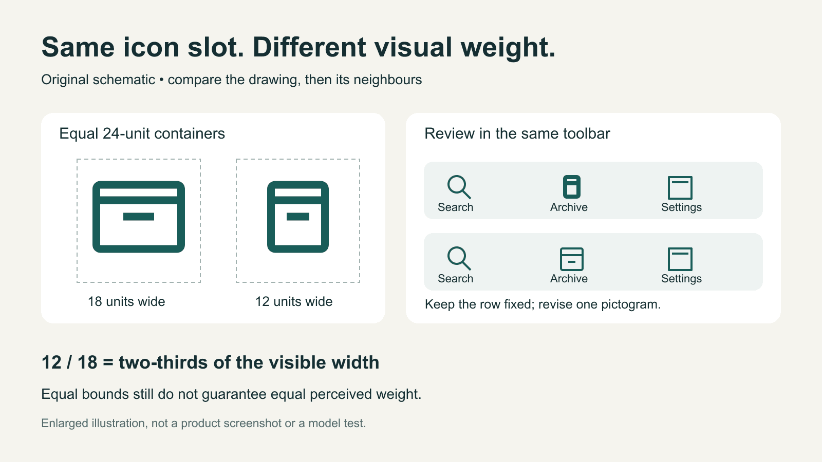
Compare AI-generated icons at their real display size. Separate visible bounds, stroke weight and alignment, with an original toolbar example and revision brief.