
AI-generated icons: match visual weight in a real interface
Compare AI-generated icons at their real display size. Separate visible bounds, stroke weight and alignment, with an original toolbar example and revision brief.
Sources checked:
Prepared with AI assistance; sources and conclusions are reviewed before publication.
On this page
An AI-drawn icon can look convincing in a large preview and still look wrong beside the other buttons in your app. Compare it in the same interface, at the same display size, before asking for another design. Check its visible footprint, stroke weight and relationship to the label separately.
In a September 30 post about refreshing Mole's icons, Tw93 describes combining stock Phosphor icons with custom SVGs made using Opus 5.5. His useful observation is that icons which look good individually can look awkward together. He evaluates them inside the product, including their neighbours and alignment. That is his reported workflow; we have not reproduced his model session.
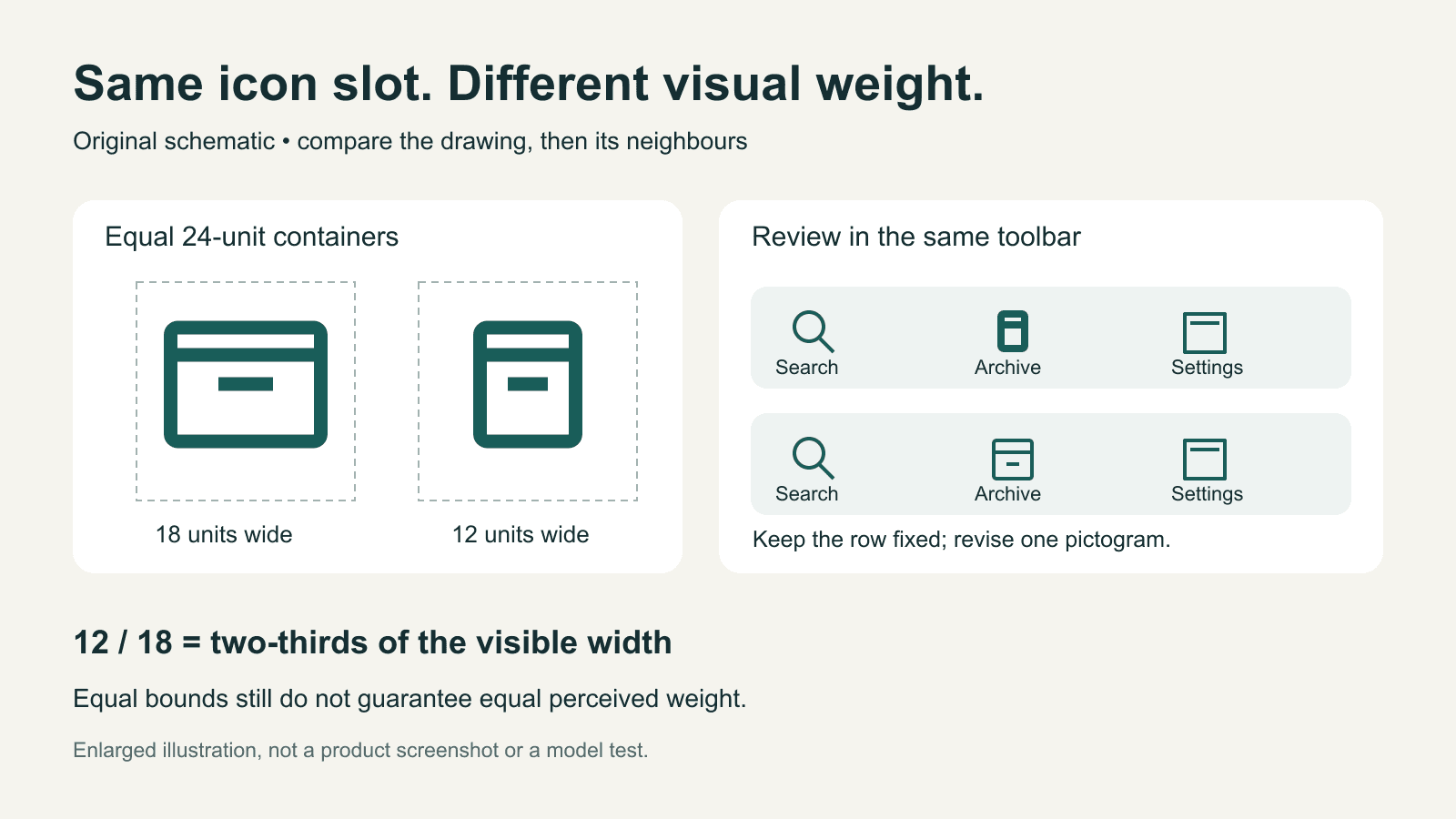
The comparison below uses original schematic drawings. They are not Mole screenshots or outputs from Opus.
Equal dimensions can hide unequal drawings
Suppose two files both have a 24-by-24 viewBox and render in a 24-pixel slot. One drawing occupies 18 units horizontally, while the other occupies 12. Their containers match, but their visible widths are 18 and 12 pixels. The smaller drawing is only two-thirds as wide.
That arithmetic isolates one possible cause of a weak-looking icon. It does not measure perceived weight: a filled shape can look heavier than an outline with the same bounds, and two differently shaped outlines need not look equally large.
| What you see in the interface | What to compare next | A bounded revision |
|---|---|---|
| One icon looks smaller, but its line thickness fits | Visible bounds inside the icon slot | Increase the drawing's footprint while keeping the slot fixed |
| Its size fits, but it dominates the row | Stroke, fill and amount of dark area | Try the family's intended weight before enlarging anything |
| The icon seems low beside text | Placement relative to the label and neighbouring icons | Adjust the visual alignment in the actual row |
| The shape fits, but its meaning is unclear | The icon and its visible label together | Reconsider the metaphor before refining the curves |
Phosphor's React documentation exposes size and weight separately and supports custom icons. Its custom-icon instructions use a 256-by-256 coordinate grid. The 24-unit example here is a simplified illustration, not Phosphor's file specification. When editing a real family, keep its own coordinate system and implementation conventions.
Put the candidate back into its row
Keep the original interface capture and a candidate capture with identical window size, theme, labels and selected state. Replace only the icon under review. If the theme, spacing and type size also change, you will struggle to tell which change made the row feel better.
View the complete interface at its intended display scale first. Then inspect a larger crop to identify the cause. A close-up helps you see a blunt join or an uneven curve; it cannot tell you whether that detail is visible in the real button.
For a fictional toolbar containing Search, Archive and Settings, imagine that the new Archive icon has a thick outline and a small interior. Enlarging it may fix the footprint while making the stroke even more dominant. The next useful candidate keeps the slot and label unchanged, increases the drawing's footprint, and reduces the outline to match its neighbours. Compare that candidate with the original before touching Search or Settings.
That is a proposed design revision, not a claim that a particular model will execute it correctly.
Give the next revision a specific target
A request such as "make these consistent" leaves several decisions unresolved. A more bounded request for the fictional example is:
Revise only the Archive pictogram.
Keep the button size, label, spacing, colour and selected state unchanged.
Use the neighbouring Search and Settings icons as visual references.
Match their outline weight and apparent size in the supplied toolbar.
Do not replace the icon family or redesign the toolbar.
Return the revised icon and a preview in this exact row.
Use the actual references and dimensions from your project. An SVG can be structurally valid while still missing this visual target, so inspect the rendered result again.
Record the decision against a particular capture: "Archive B fits the outline weight at the normal toolbar size; its lower edge still looks low beside the label." That tells a collaborator what to retain and what to change. "B looks better" does not.
Present the decision with its context
When the comparison needs to leave the editor, keep the two full interface captures together and place each detail crop beside its parent. Include the display size, version name and the specific unresolved issue. The reader should be able to trace a crop back to the exact interface it came from.
Creatos Content nodes support imported images and text. You can use them to arrange those captures with the revision request and decision. Make the captures and SVG edits in your design or development tools; this workflow does not depend on automatic icon measurement or SVG editing in Creatos.
For an AI-built screen with broader layout problems, first prepare the screenshot-to-website handoff. Return to the individual icon comparison once the surrounding interface is stable.
Sources
Continue reading
Browse all posts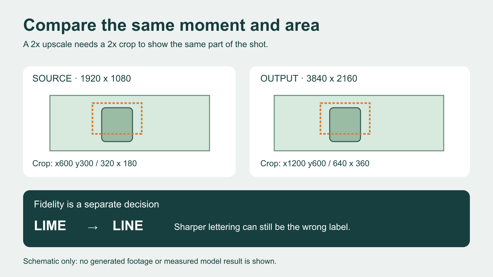
AI video upscaling: compare detail without changing the shot
Compare an AI video upscale with matching timestamps, crop coordinates and display scale. Separate sharper detail from changed lettering and motion.

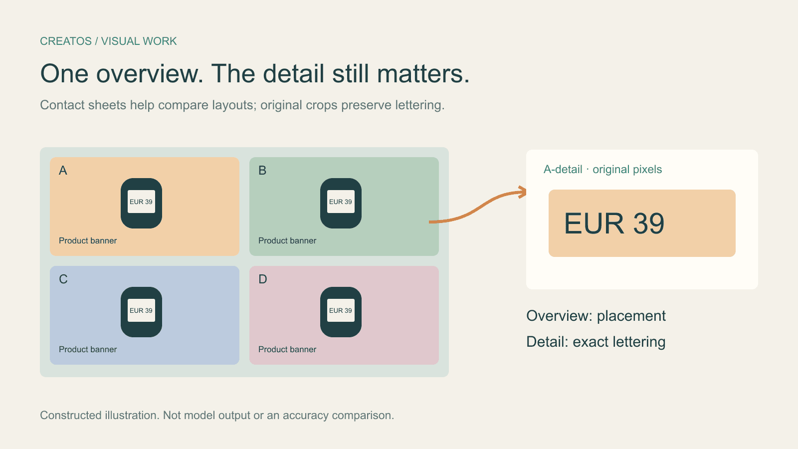
Claude image review: keep small text readable
Compare a contact sheet, separate images and detail crops using Claude image limits, with reproducible pixel and token calculations for four banner variants.
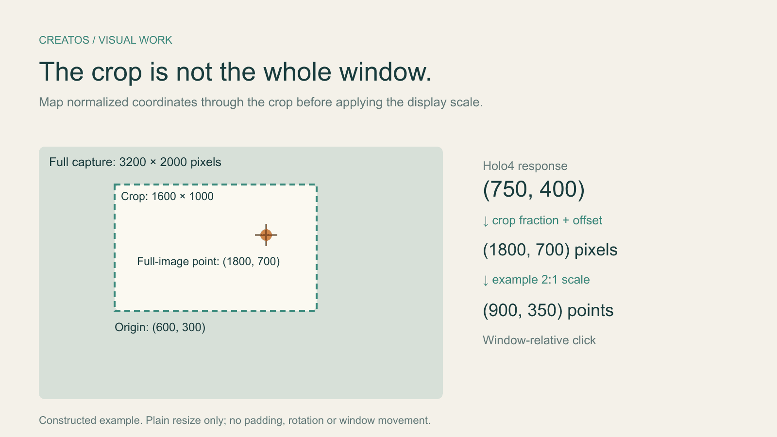
Holo4 click coordinates: fix crop and Retina offsets
Map Holo4 normalized coordinates from a cropped screenshot back to a design app. Includes a worked Retina example and locally tested Python conversion.